PowerPods
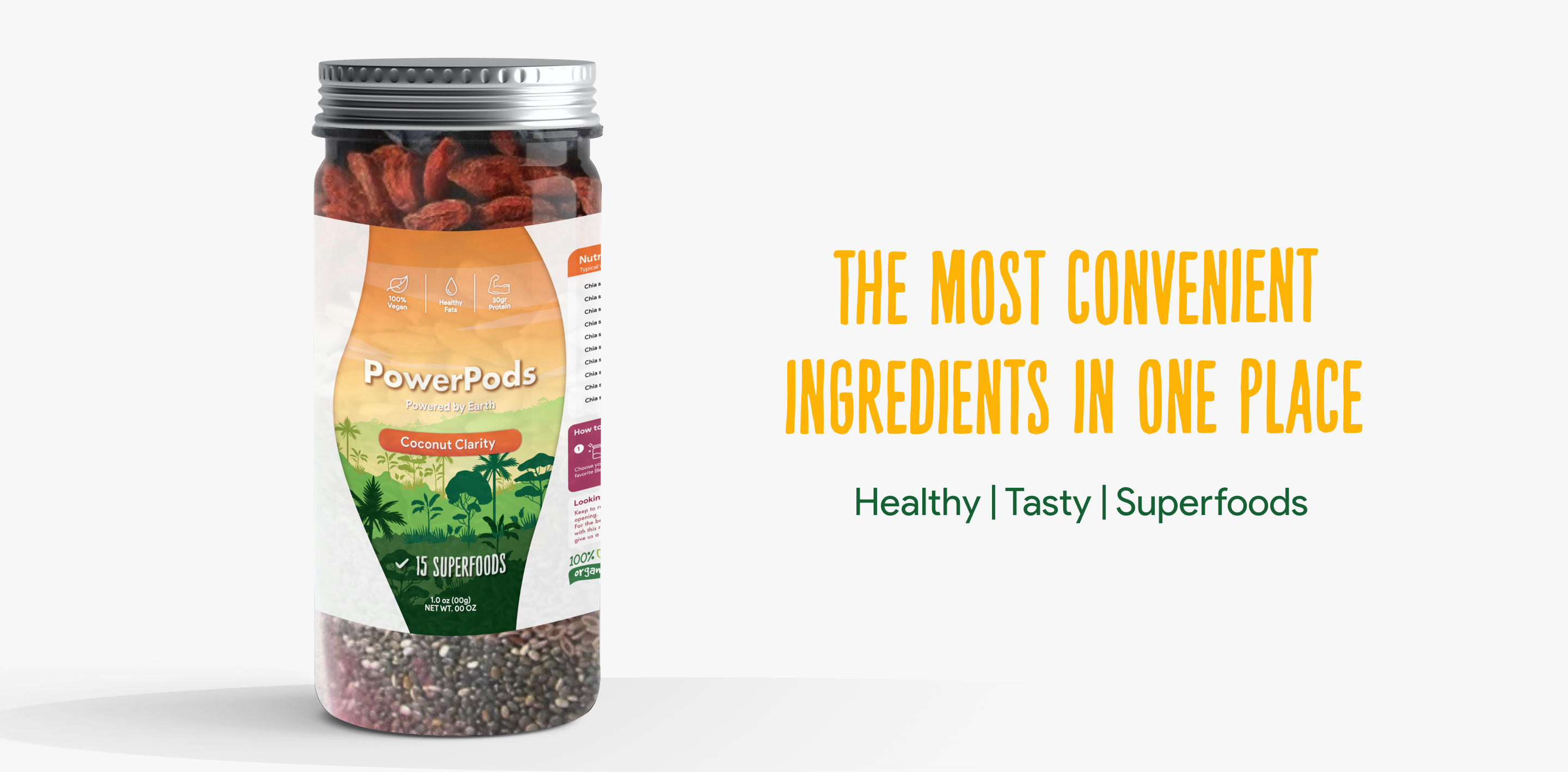
A startup located in California, specialized in distribuiting the best quality superfoods
PowerPods
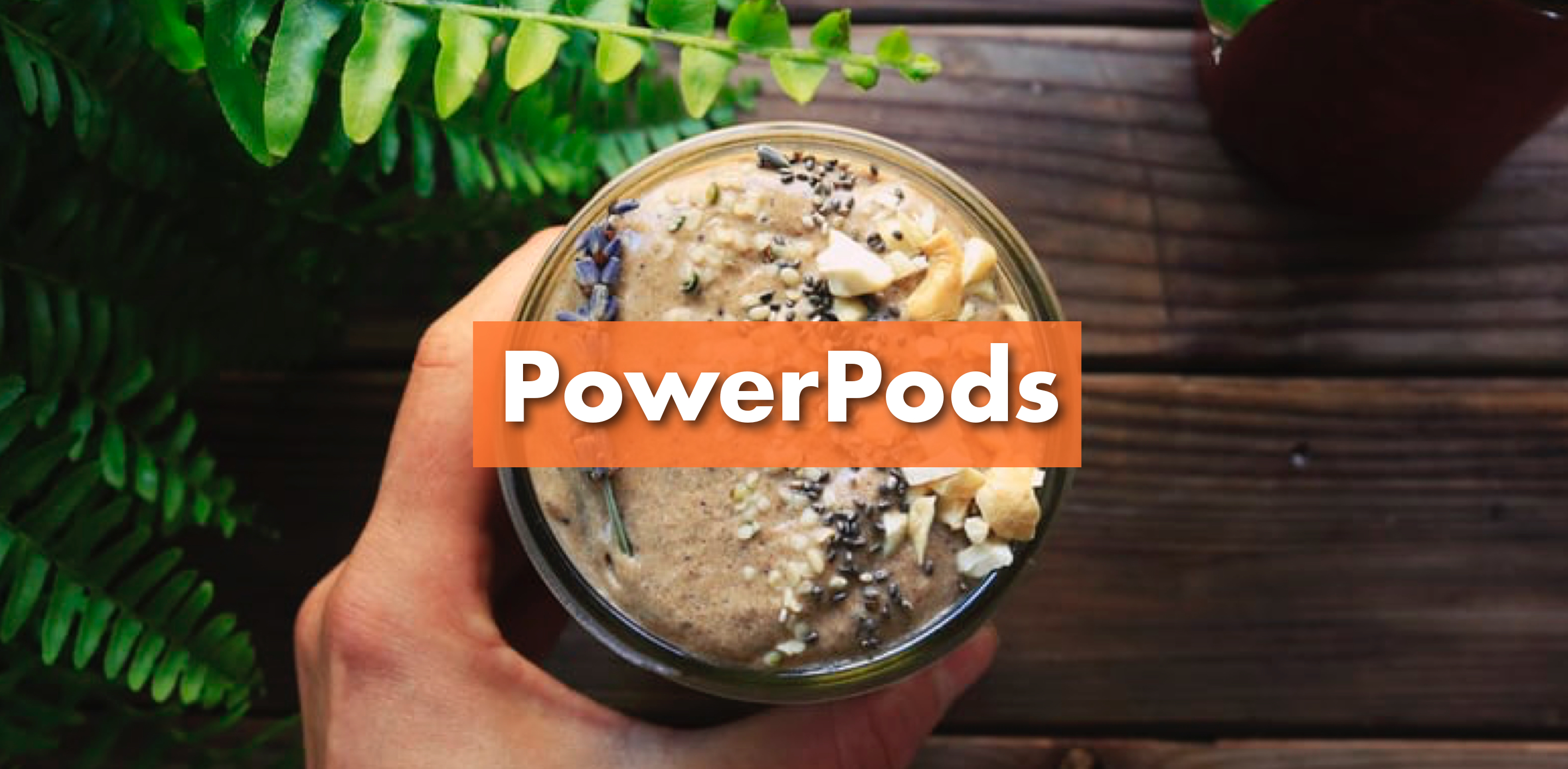
A superfood startup based in California offering a convenient way to get the world's best superfood ingredients.
Building the Identity
The owners of the startup approached with the idea of creating a minimal variable product to test the market. After discussing about their goals and the brand voice, we start the development of the identity.

Branding | Authentic storytelling
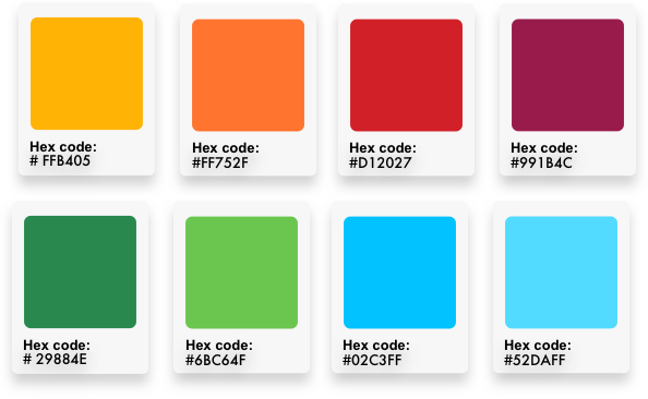
The color palette and typography is focused on expressing convenience and nutrition, fresh and organic values.
After several rounds of feedback we got the right colors and font selection, then I procced to sketch and digitalice the fist product label.
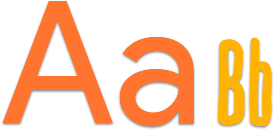
Sustainability | Quality | Happiness
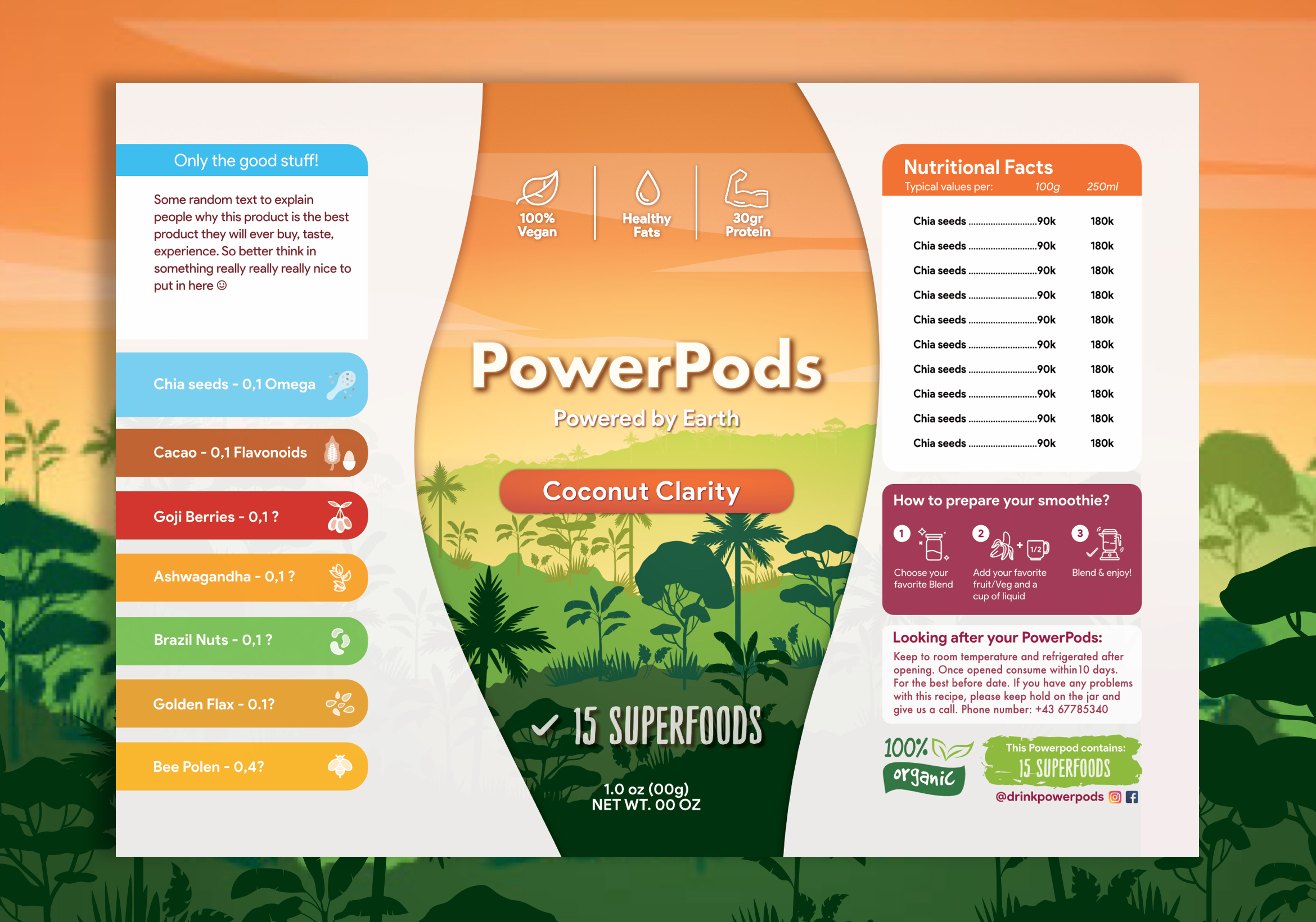
Bold, simple and original. The selected font was used mainly to enhance the nature of the product and its playful tone increases reliability of the brand.
