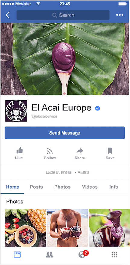
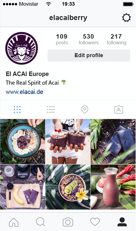
El Açai Europe
Sharing the Spirit of Acai
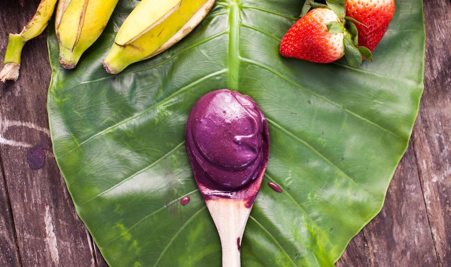
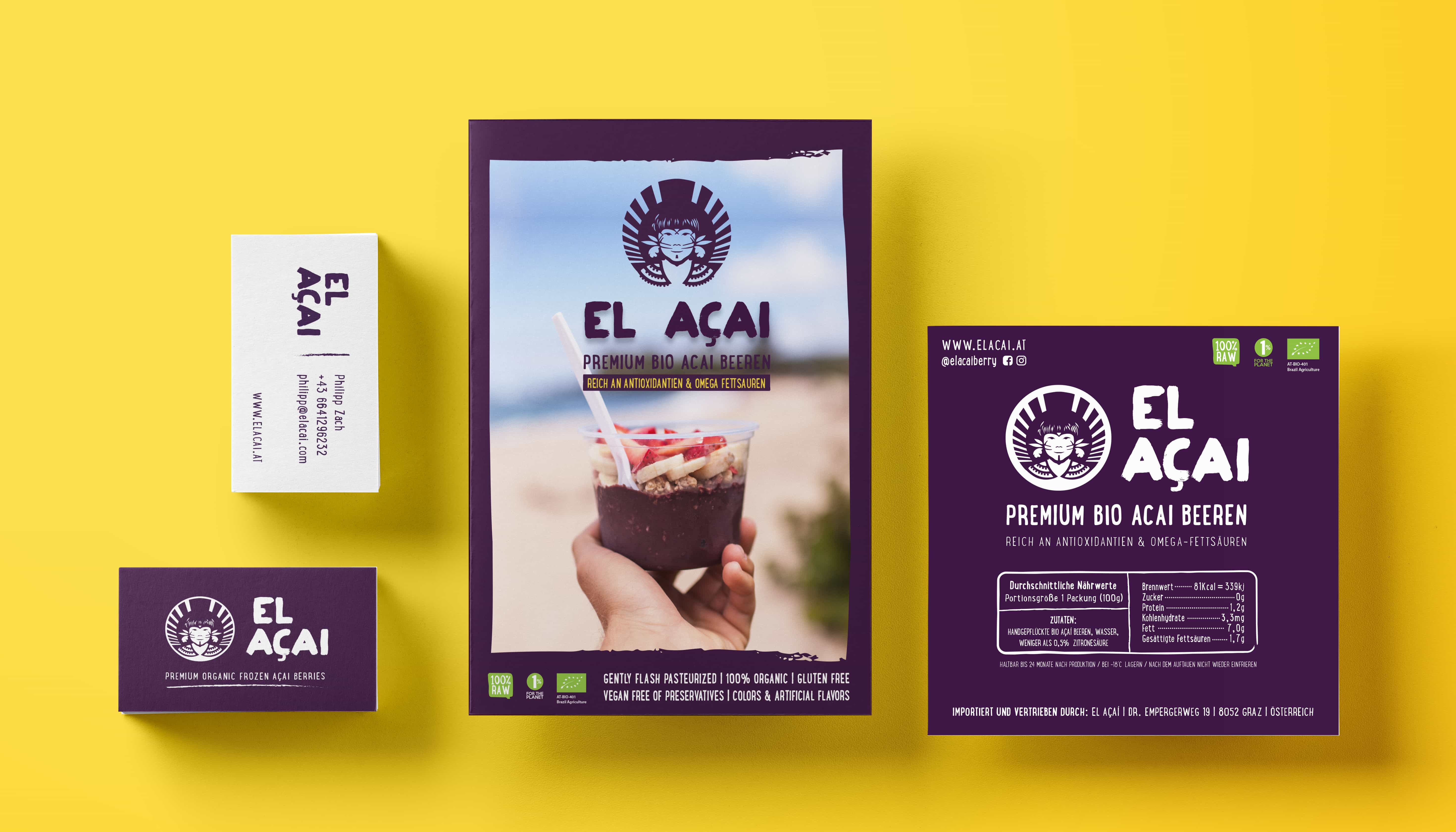
El Açai Europe
A company located in Austria responsible for distributing Premium Organic Frozen Açai all around Europe.
Building the Identity
The goal: Unique with a high visual impact
Since the Acai berry is relatively new in Europe the logo should have a high visual impact to attract the curiosity of the market, it should represent a new flavour, a new experience and the at the same time retain its brazilian roots with the european public in mind.

To represent its premium superfood and grade ‘A’ special feature, I decided to create a halo around the logo which would reflect its uniqueness, guaranteeing us in a graphic way its high nutritional value and quality.
The main graphic was inspired by the indigenous people of the Amazon, of which the companies feel extremely responsible, as well as being used to represent the true spirit of El Açai: encouraging a healthy and sustainable lifestyle.


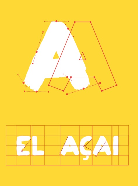
Fonts
Is all about the fun!
Bold, simple and original. The selected font was used mainly to enhance the nature of the product and its playful tone increases reliability of the brand.
All the type faces are easy to combine and ready to be used for any printed and online material.
Colour Palette
Welcoming a new color
#welovepurple
Complementing the strong purple characteristic of the Acai I created a bright color palette using green which reflects the origin of this small berry and yellow as a representative of clean energy and healthy living.
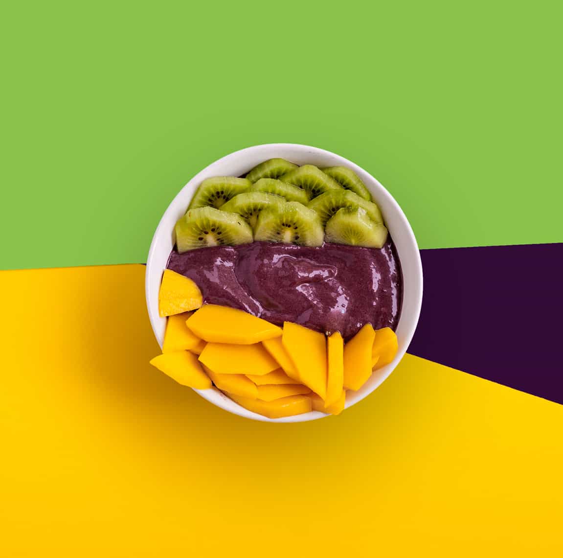
They also represent the core values of the company:
Sustainability | Quality | Happiness
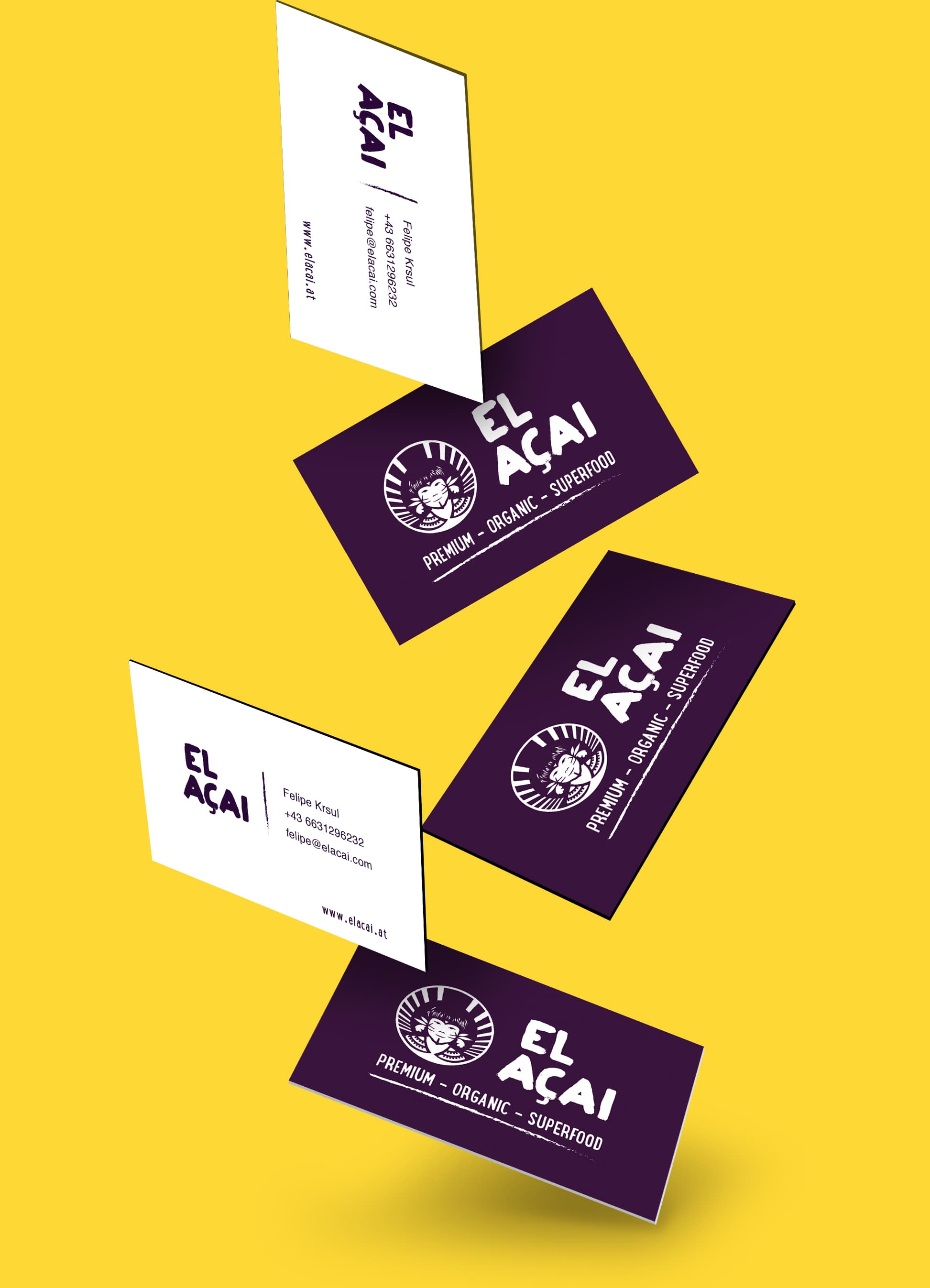
E-commerce for Desktop
Healthy had never been that delicious
An easy way to get this delicious superfood to your doorstep! A user who signs up for a subscription gets incentives to help the world by using sustainable packaging and donating part of their sale to an organisation dedicated to protect the planet.

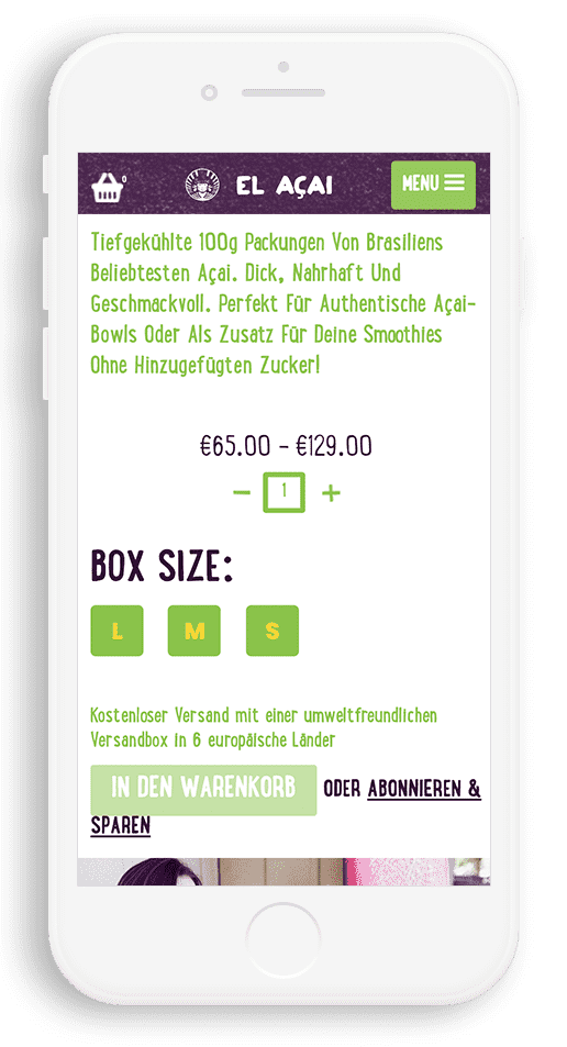
Mobile Design
A preview of the app :)
What I really enjoyed about this project was that I could use my imagination freely to create media content for the brand. And of course, eat all the Acai I wanted in the meantime :D
