Camp Bay Lodge
A mindful experience
What is actually
Camp Bay Lodge?
It is a hotel located in the uncrowded East end of Roatan, totally removed from the regular tourism hustle surrounded by exuberant nature.
Building the Identity
Reflecting Camp Bay Logde
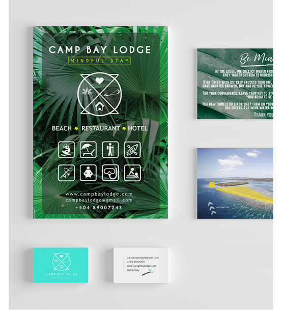
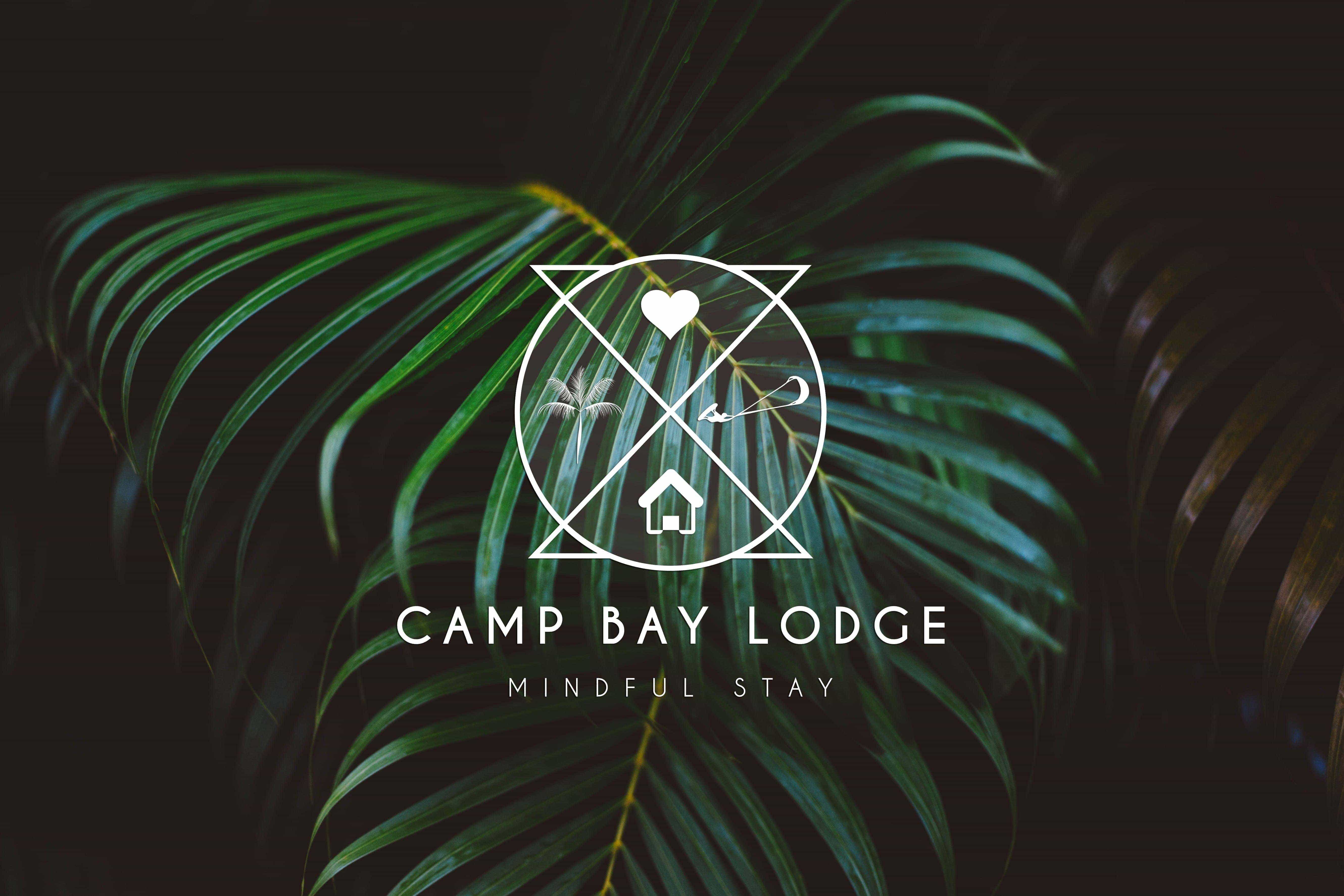
The client was very clear about message behind the logo: the Lodge is more about a place where you can return to the true nature of self, surrounded by a majestic nature and still have the opportunity to connect with the moment through yoga, meditation or any sports activity.
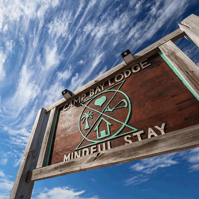
The final logo was also carved in wood by local artists, giving an original touch to each space of the place
Color Palette
Inspired by nature
After getting inspired by the island of Roatan, I decided to complement the favourite colour of the client: turquoise with a light blue representing the panoramic view of the sea along with two monochromatic grays to give a professional and reliable style.
Developing the logo & base shape
The main idea for the realisation of the base shape was representing the universal law of: “ as it is above so below” referring to every thought that we place in our mind will shape our reality.


This idea was reflected in a very simple way though two inverse triangles and a circle representing the whole. The definition was very pleasant for the client due that Camp Bay Lodge is not just an hotel but a space for reflection where you can find the balance in your mind and therefore in Life.
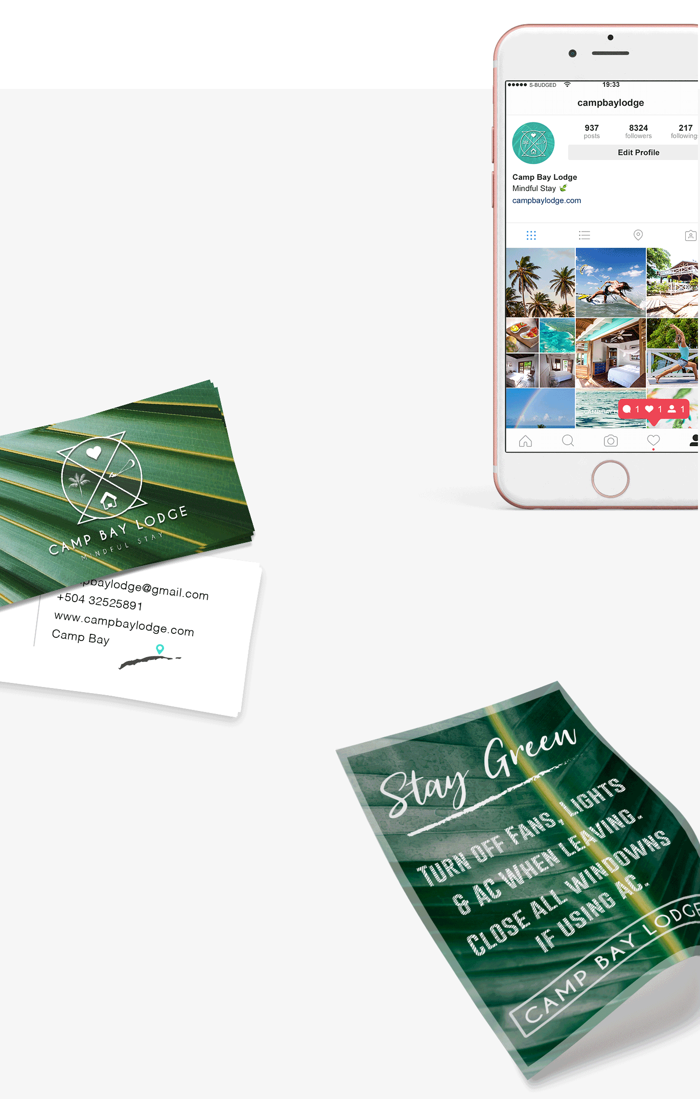
What I love the most while designing this!
This idea was reflected in a very simple way though two inverse triangles and a circle representing the whole. The definition was very pleasant for the client due that Camp Bay Lodge is not just an hotel but a space for reflection where you can find the balance in your mind and therefore in Life.
